Not everyone is blessed with the ability to create jaw-dropping content.
But as the tidal wave of visual content hits, creating beautiful content has become a necessary skill for social media marketing.
Sharp design exhibits professionalism, generates credibility and displays awareness to online audiences.
Think about it. Don’t you feel more at ease buying from an online business that showcases its products or services in an attractive and effective manner?
Of course you do!
So, what is good design? That mostly depends on the eyes looking at it. But there are a few things that make or break a piece of content. Follow these 3 steps to learn how to go from meh to ahhhhh with your online content. These principles can be applied to any photo, graphic or image you create.
Step 1: Fontography.
Fontography is the study of fonts or lettering. Fonts are not created equal, and they make a huge impact on the mood you communicate to the reader, so choosing wisely in important. By the way, Comic Sans is a no go. Ever.
There are whole courses dedicated to fontography, but since there isn’t time for that, I will cover the most relevant rules you need to know.
1. Mix serif and sans-serif fonts together.
Serifs refer to the tips on text, and sans-serif refers to the lack of them. Pictures explain best. 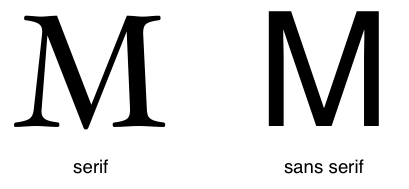 When you mix the two, it generates a heightened emotion or style. Sticking to one or the other brings about smoother feelings. For example, the Franklin Gothic in this picture is considered modern while the Garamond is classical.
But the use of both heighten emotion and variety. This Marie Forleo graphic uses a sans-serif font to express the general message, while adding the attribution with a sans-serif font.
Additionally, check out her brand signature. It’s a mixture of the two. It shows she is both a modern lady with a bit of elegance, which if you follow Marie, is true.
Another example is one of Sandi Krakowski‘s quotes which uses the serif for the title, but the message is sans-serif. And unlike Marie, her branding signature is entirely sans-serif (bolding her name to differentiate it).
2. Add a complementary font to your branding font.
The chosen brand font influences which fonts are complementary.
Add your original font to a blank page and combine it with others to create a few complementary matches. Different sets will connote different emotions and can be used in original ways. Be adventurous, and ask for second opinions.
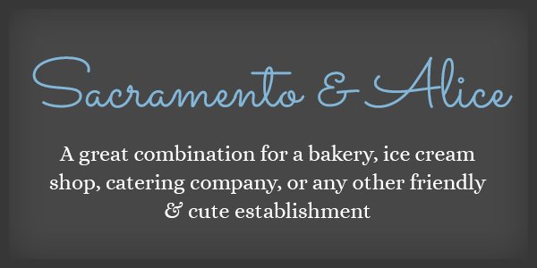
This Sacramento & Alice font expresses a sort of whimsical comfort. This plaque mixes a handwritten font with a serif.
3. Stick to easy-to-read fonts for small text.
While you may enjoy a serif or calligraphy type, if there is a lot of text or the text is small, use a sans-serif to make it easy to read.
Check out the Month, Day and Year font – a sans-serif font makes them possible for anyone to read even though they’re small. 
4. Text placement.
Right, center or left can be a big decision. There is no easy formula for where to put your text, but it should balance out the image placed with it.
These examples should help explain.
Left. The focus of the photograph is on the right, so placing the text on the left will even it out. If it was placed in the center the font would take away from the photo, and right would be plastered over the people.
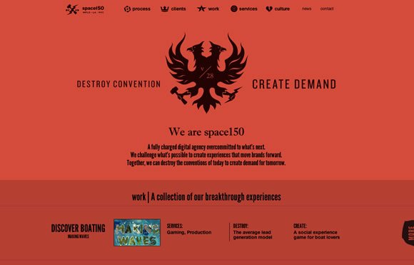
Center. There are two things to take note of here. 1) The brand slogan is four words (Destroy Convention Create Demand). 2) The logo is large and circular.
The best decision would be to place the logo in the middle and cut the slogan in half (with emphasis on its focus). If the slogan was three words, this would have been impossible for aesthetic reasons.
The logo would have been placed on either the right or left side. Finally, the business name was centered directly below the logo. If it was placed anywhere else, the name would have been confusing to the viewer.
Right. The photo is placed on the left and seems to be looking in the upward right direction. This is a marketing tactic that says people look where others do, so marketers often place pictures of people looking or pointing towards text to give it emphasis.
But, the text is actually centered with the picture even though it resides on the right side of the picture.
Action steps:
1. Check out a few free font websites and nab a few that appeal to you (with consideration to your branding font).
2. Use a few pictures and play around with combining texts. Go for mixing extremes and see what type of emotions you can generate.
3. Play around with the placement of those texts. Left, center, right.
4. Take the font combos and add them to a Google Doc or somewhere you can easily access them the next time you create a graphic or image.
5. Have some fun and be creative!
Step 2: Artwork
Choosing pictures for social media or website content is not always an easy choice.
You may love pastel colors and fluffy clouds, but if your brand is edgy – it obviously won’t work.
There is a method to the madness, but it is only suggestion. So take these guidelines, and think about how they can work for your business. Being creative is about experimenting, and therein lies the magic.
1. Pick artwork that stands out against font choice and color.
First, you must decide if the artwork will be 1) the focus of the content piece or 2) be the background. Either way, it is essential to pick an image that could reside online without a message, but still attract attention from online viewers.
Basically, it should be pretty!
But mainly, it should be an image that will not interfere with the font or font color. Simplicity is underrated, and when in doubt, go for a clean background.
What I love most about Kimra Luna‘s website and graphics is the stark contrast between her background images and the font color choices. They’re bold and eye-catching, BUT very simple.
2. Choose artwork that matches your brand.
There’s no reason to use pictures of milk cartons if you have a conservative software company or a picture of a lightbulb for children’s toys.
The chosen artwork should match your brand and/or be simple enough it doesn’t matter. The more it correlates with your brand, the more people are going to mentally connect it with your brand, which is a plus for you.
Sandi Krakowski used to be a body builder and often talks about the importance of being healthy and exercising. It’s just as much a part of her brand as the motivational quotes and verses she shares everyday.
This simple graphic matches any brand and explains exactly what the message of the graphic is for. (Which leads us to the next point..)
3. Use artwork to enhance the message, not work against it.
Using artwork that clashes with the overall message is counterproductive. The artwork and font choice must work together in correlation with the content’s message.
For humorous posts, use fonts with personality, incorporate playful colors and/or blatant pictures that drive the message home.
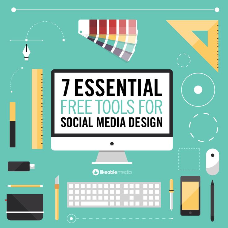
Likeablemedia did a great job putting together this graphic. It emphasizes the focus perfectly with images, colors (minimal), and font choices (modern, sans-serif).
Melanie Duncan put together a stunning graphic that mixes a bunch of elements without looking cluttered. It contains 3 different fonts, a personal picture and a transparent overlay to make the fonts stand out.
The goal of this graphic succeeds because it’s asking the user a question, and she’s looking directly at you as if she just asked it.
Bundlepost, a content management system (that I can’t LIVE without) always has some fun with what could be a considered a dry product. Software isn’t exactly sexy, but they do an excellent job of incorporating humor into the brand with comical graphics.
This graphic is a great example of using the image to match the message in a blatant (but witty) manner. Everything works here – 3 font choices, 3 font colors and two images pieced together with the logo in the bottom right corner to remind the user where it came from.
Action Steps
1. Decide what the message of your content piece is going to be, i.e. quote, promotion, etc.
2. Think creatively about how you can depict that message in a visual way i.e. with subtle, blatant or abstract imagery.
3. Go fishing online for graphics! Here’s a few awesome places to nab FREE images. *Do NOT neglect the importance of checking the copyright before using an image.
- Gratisography
- Dotspin
- Pixabay
- Superfamous
Or use content creating apps that offer cheap images you can purchase
4. Combine all the elements together until they match! TIP: For inspiration, hit up Pinterest and Search for a term that describes your idea in some way. I love using Pinterest, Google Images and Facebook to get my creative vibes going.
Step 3: Optimize for social sharing.
1. Add your business logo or website link to the image.
How will the viewer know it belongs to you if you don’t claim it?
Adding attribution ensures that online users know where it comes from, and it spreads your brand when the graphic is shared.
Kim Garst does a fantastic job of tucking her branding signature into motivational quotes, social media tips and graphics by placing them in the corner. Notice it’s not obtrusive, doesn’t look sales-y, but adds to the overall graphic. 
2. Size is everything! (well, kinda)
It’s vital to plan ahead and know how big the piece of content needs to be. Different social platforms require different size graphics depending on what they are for. A Facebook Timeline image doesn’t need to be the same size as the cover image, etc.
I’ve read that Facebook pictures should be 600 pixels wide, but a minimum of 650 works better for my clients. Especially when it comes to sharing blog posts and articles on Facebook.
Blogs should offer the capability to upload a Featured picture that doesn’t show up in the actual blog, but is perfect for social sharing. If not, place one at the top of your blog post and Facebook should pick it up.
One of my pet peeves is coming across an excellent article featuring a tiny graphic. It’s the perfect example of how NOT to optimize your content for social media.
Get in the habit of using big images, so not matter what, your brand is well represented.
You won’t find this image in the article by Social Media Examiner, but it was optimized it for social sharing and grabs the attention of readers.
And it definitely looks better than the Google image.
There isn’t really an optimized size for Twitter pictures, but as a rule I stick to at least 600 pixels. 
Again, larger pictures – at least 600 pixels.
This example shows what happens when the image is too small.
I barely saw it in my Pinterest feed and that’s exactly what you don’t want to do! However, they do get some points for using an easy-to-read font. (I’m not totally heartless, haha)
Google+
Let’s just go with big pictures all around! A minimum of 600 pixels.
You can get away with smaller images on G+, as little as 400 pixels, but it’s not worth the possibility that someone may want to share your content (blogs, images or graphics) elsewhere. 
So, lesson: BIG IMAGES ARE BEST! (No, not yelling – but it’s crucial!)
3. Choose the right format.
I’m sharing as if you don’t know what a JPG or PNG is.
Suffice it to say, they’re two different kinds of image saving options.
All you need to know is that JPG’s are often best for smaller images, while PNG’s have a knack for compressing large images into lightweight file sizes. And since we have discussed the importance of larger images, I’d advise to stick to PNG’s. It’s my preferred image format for web-ready graphics.
4. Use consistent branding across ALL social platforms.
Consistency in all things is imperative.
Using the same or similar graphic ensures that your audience know when they are interacting with your social channels.
Use a high-resolution image of yourself or your logo for the profile picture, and create background images to match your brand.
The one exception is the Facebook cover photo, which should change at least once a month and feature promotions, information or products/services you offer.
Action Steps
1. Don’t forget to add your business’s logo/website link/signature to EVERY image or graphic that is shared socially, including blogs.
2. Create graphics larger than 600 pixels wide from the get-go! Starting with a larger canvas gives you confidence that your graphic will look good on every social platform.
3. Jussst PNG it. PNG, PNG! It’s wonderful for website photos and will kick your website upload speed up a few notches.
4. Play around with your Facebook cover photos and incorporate holidays, specials, or fresh graphics. Have fun with it!
